SuperBolter Brand Book
The brand guide for SuperBolter
Section 1 : Crafting the Core Value Prop for Superbolter
Step 1: Product
What business is the product in ?
The product is in the business of home interior design where any person can diy-design their home effortlessly. We are starting with design on mid-premium residences and will later expand to commercial spaces such as offices , stores and factories.
What problem is being solved for customer?
Everyone aspires for a dream home that mirrors their personality and style. The harsh reality is that for many a dream home remains just that - a dream. They face three formidable challenges :
- They struggle to visualize how different elements look together and fit into their space making the experience of interior design seem daunting.
- There is a constant tug-of-war between design aspiration and budget limitations leading to frustrating cycles and unnecessary compromises.
- And finally, the existing 3D tools in the market are extremely complicated and built for skilled professionals and not common consumers. The large upfront time and effort that they demand makes adoption tough.
What are some of the Customer Benefits?
Consumer can design their dream home quite effortlessly without having to go through the hassles of complicated software tools and processes.
They get a fairly decent virtual 3D model of their home without having to draw anything.
Not only can they visualize the design easily, they can also see a real-time live estimate of the design.
This empowers them make a well informed decision on how the home interior looks and home much it costs.
Since the products listed are real-world products available in the Indian market, AND the brand names are mentioned and not masked, this helps them to know where to source the products.
How is the user currently solving the problem?
The user today largely solves the problem via these two routes :
- Hire a carpenter or a contractor. This is a lower cost option. But the design decisions usually need to be made by the consumer. This can result in unimpressive novice design for the home. The design is usually finalized within a week.
- Hire an interior design firm. This option is more expensive. Here the interior designer engages in an iterative process with the customer to create designs. The design process takes 15-30 days depending on the size of the project.
In both the cases, pictures of prior works as well as room images from the internet ( pinterest, google, houzz) are used by the consumers to guide the design discussions.
Step 2: Define the JTBD for the brand ( Market and competition)
Is your product operating in an existing category or new category?
New Category
How is the user currently getting their home interiors done?
They either hire a contractor/carpenter or an interior design firm. In the case of the former the chances of getting a designer home is low.
Is your product a push or pull product?
Push product as consumer is unaware of the brand. The awareness of other 3D tools too is low.
JTBD for the Brand?
For a Push product in a New Category, we will solve for Education, Relevancy & Need and Trust
We Need to educate the consumer that SB exists as users may not even know that such a product exists.
Its very relevant to their current need to design their new home.
We need to earn their trust as our business model will rely on them transacting on the marketplace.
Step 3: User : Understanding your user ( Define ICP)
Gen XY Migrant Techie
Age - 38yo
Gender - Male
Current Location - Bengaluru , Metros
Hometown - Tier 2 City.
Salary - 40L-60L
Apps - Swiggy, Zomato, Uber, Scripbox, MyGate, Zerodha, Bank app, Paytm, Google Pay, UPI, urban company, Makemytrip, BookMyShow, perpper fry,
Social apps - Linkedin, Facebook, Instagram, Youtube, Whatsapp
Apps for home inspiration - Pinterest, Google Images, Instagram, Houzz
OTT - Netflix, APV, Hotstar
Marital Status - Married (6-10 years)
Kids - 1 Young kid ( 1-6 yo)
Profession - Senior QA Manager in a technology company.
What do they watch/read/ listen? - Netflix, APV, Hotstar, News - current affairs, politics, equity markets) , IPL, Gaana, Spotify, Times of India, Economic Times.
Who do they follow - Interior design influencers and brands, Livspace, Homelane, Design cafe, Finfluencers,
Where do they spend - EMI for new home and car, Rent for current home, School fees, Insurance (Company ghis, personal insurance - health and life) , Investments (Mutual funds (sip) , stocks, gold, pf, emergency liquid fund )
International vacations - Once in two years.
Domestic vacations - Twice a year during school holidays ( Summer, Dusshera, Christmas/New Year )
Current Vehicle - SUV ( <Rs. 25L )
Current Home Type - Rented
New Home Type - Apartment ( First buy)
Apartment Cost - 60L - 1.5Cr (Bangalore)
Interior Budget - 8L - 15L (Bangalore)
Personal goal
Social goal
Functional goal - To get the home interiors done so that they can move into the new home. The home interiors should be well designed and should fit into their budget. The project should not get delayed as it piles up the rental costs.
Financial goal
Fears and Apprehensions:
What if I get overcharged ? What if the vendor cheats me with the quality?
Can I design the home by myself? Am I doing it correctly? What if I commit any mistake in the design?
Can I see some of the existing projects or completed projects of the vendor ?
Barriers
Not aware of easy DIY home design tools. Existing 3D tools have a steep learning curve.
Step 4: Articulate the Core Value Prop (CVP)
TARGET CUSTOMER
for [a budget conscious mid-segment New home buyer ]
who [aspires for a well designed home]
[Superbolter] is [an Online home design platform ]
that [enables an effortless diy home design experience]
Values : Money over Time.
Section 2: Creating the Brand Wedge and Brand Footprint
Step 1: Articulate Core INSIGHTS
Category Insights ( how does the user currently react to the category)
Interior designers are expensive as the designers charge a big premium. And Most carpenters do not have interior design skills. Most interior designers say that 70-80% of their business comes from referrals. The consumer is basically deciding on a vendor based on just 1 review.
User Problems ( what are the top problems the users face)
Getting a good design is not easy unless you hire a good designer. There is no easy way to DIY.
User Non-Negotiables ( money, quality trust or something else)
Get a best quality of design that their money can buy
User Negotiable ( what are good to haves )
Learning curve needed
User Aspirations/Goals ( what are the outcomes that user wants to solve)
Well designed home within their budget
STEP 2: BRAND WEDGE
If category perception
[is that interior design is opaque and expensive]
And my user feels
[there is no easy way to do it myself and it is complicated]
The [Superbolter] will always prioritise
[to empower and educate the customer to very easily and confidently design their home and finalize the products as per their budget]
"You can do it"
Brand Archetype
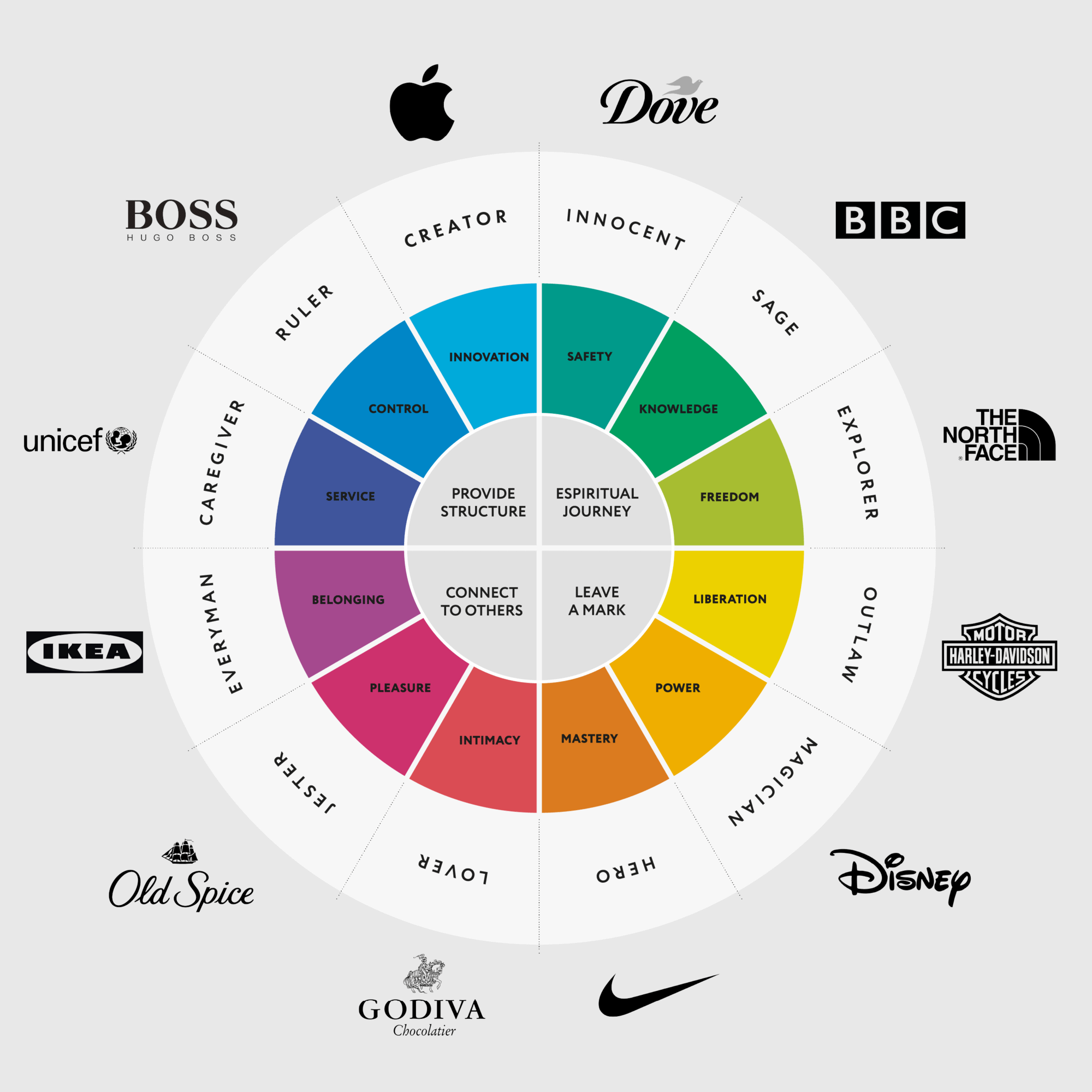
SuperBolter's Brand Archetype is Everyman. The main traits are inclusivity (empower everyone), simplicity and relatability. There are some traits of Creator and Magician too but traits of EVERYMAN over-compass them.
STEP 3 BRAND FOOTPRINT
Brand Look
I AM [modern and innovative], but I'm not [overly complex or intimidating.]
Brand Colours : White, Red and Black. To create a clear, bold and contemporary visual identity. Also the HERO on the site needs to be the visually appealing room designs and products which would already have a lot of colour. Hence rest of the stuff on the site should support those images well.
Example.

Brand Speak
I AM [forward-thinking and dynamic] yet [ down-to-earth and user-focused]
But I'm not [Overwhelming and complicated].
Brand Voice: (what you say)
Engaging, Informative and Friendly
We will cheer the user for every small win to build up their confidence.
Brand Tone (how you say it)
Conversational yet professional,
Should reflect approachability and expertise.
Brand Writing Style ( choice of words and sentence structure)
Clear and concise. No technical jargon. Even if used, there needs to be a ready help on what that jargon means. Jargons would show up when talking about design styles ( Contemporary, Zen, Shaby-chic, etc) or when talking about characteristics of a product. We will complement the words with visuals and/or (?) help buttons for user to learn more about those terms.
We will use Active Voice instead of Passive voice.
Example:
"You email is verified " instead of "Your Email verification is done"
Brand Behave
I am [Authentic] But I'm not [Pretentious]
This sets a positive tone by emphasizing authenticity while contrasting it with the negative trait of being pretentious.
Superbolter values genuineness and sincerity in its interactions and branding. This should resonate well with customers who appreciate honesty and transparency. The customers should not be in any grey area whether it is about how superbolter works, what they do on the site, or what happens if something goes wrong.
Since this is a new experience for a high intent customer, we will try to be as simple and easy to understand as possible so that they feel fully empowered to scale through any barriers for adoption.
SECTION 3: Apply the Brand Footprint
Superbolter.com
Landing Page ( Before signup)

Change the bullets text to
- Access our hassle-free 3D home and interior design solutions.
- Explore over 1000 meticulously curated designs to jumpstart your design journey.
- Personalize your spaces with our library of 20,000+ real-world products.
- Track your budget effortlessly with our innovative Live Estimate feature.

"A simple new way to design" effectively communicates that we are both new as well as simple.
The current text seems ok. Here is another version
""Designing should be easy. Yet, we've tangled ourselves in pricey, time-consuming processes and complex software, making design seem daunting for many. Enter SuperBolter, revolutionizing the game with a user-friendly tool that simplifies design for all.""

change to " 75+ reputed brands trust us"

"4 steps" -> conveys that in a finite number of steps a dream home can be achieved.

Change to ""Easily design each room using an extensive catalog of room designs and products""

Change to " "Simplify Budget Planning with Real-Time Price Estimates"

Change to ""Connect with Designers or Contractors: Make Your Design a Reality""

Todo: This video needs to be changed to reflect both the new product flow as well as the new brand .

Change the testimonials from the above image to the below image. It seems mopre credible.


Add Helpline number, Social media handles and customer care email.
The helpline and email can also be added in the header.
Signup

Tagline says " Beautiful Homes for Everyone" as per the Brand achetype. The pattern image gives a sense of Design and creativity.
"New Here? Create an account" and "Can't login? Reset your password " : Set a friendly tone.

The login page and Create an account page is built as a single page to get a user to move quickly.
We could use the left section to further speak about the brand.
We can show a gif which shows
"Beautiful home for everyone" -> User testimonial 1 -> User testimonial 2 where these testimonials specifically talk about how easy and empowering those users felt using the platform.
"Continue with Google " -> gives a safe and easy option for users to signup confidently.
Todo: The Terms and Conditions checkbox or link is not shown in the sign up screen. Also, add a link for privacy policy. This should give the user more confidence about the platform and we can be more Authentic.

Add the text : "You are now part of a 50,000+ community of creators who have set out on creating their dream homes. "
Signup : Setup Profile


The options are clearly listed for the user to choose from.
Todo:
Switch to a grid layout instead of a list for easy readability.
The visuals can be improved for each of the options. We can use illustrations that are created using the brand colours.

We have not directly jumped into room designs and products instead we have used images that user may be familiar about.
The progress bar above helps user to know where they are in this mini journey.


There is no select all button atleast at each category level. This can help user move through this form more quickly.

This question applies to home owners but not the other user types. That needs to be fixed.
Key end consumer use cases have been covered here.
TODO: "Select as many options as you like" is an error as this form support only a single option from the user.

This question is vague. The intent was to find out when the user wants to start the implementation of the project in real life. This is not clear.

The success messages and the visuals are crafted in a manner to install a sense of accomplishment in the user.
Onboarding
Onboarding : Tutorial

Todo: What is 3D Screen Test?
Reword:
Hi <Name>
First time visitor? Let's see if our 3D works on your computer.
CTA: Start
"takes only a few minutes" informs the user that this will get over quickly.

The duration of each video is mentioned too. In this case its 13 sec
the subtext in this video reads
"This takes slightly longer than usual but it's worth the wait. We Promise".
Makes us more Authentic. And at the same time puts us up for Trial. We better make it awesome. And we do.

This screen doesnt have any other links or buttons but the ones that the user needs to interact to go through this test. There is a 3D component and a simple question with Yes or no.
If user clicks on No, a help form opens up where user can submit their concern. This shows that help is available at every step.


This is the first design experience on the site and a potential Wow moment.
Todo: Sometimes users struggle to understand how to apply the paint. We could show a visual indicator on the walls in the 3d room with a short help caption "Click here or apply here"

todo: While the video shows how to do this, we can add some additional help in the 3D to help user select the sofa and move it.
"Click on sofa to select it" " Drag the mouse along the floor to move the sofa"
We can also show this as help text on the right side below the help video.

This is the second wow moment when the user is able to design a room in a click.
Change text to "Click to Apply Design" and it can be in Red to bring the attention.

The text can be changed to "Congratulations! Your computer supports Superbolter 3D! Happy Designing! "
Onboarding: Dashboard

This page needs to be redesigned as there is quite a bit happening on this page.
Instead of showing 4 Demo homes that user can try, we could show two options ( Like in Loom)
"I want to Practice " "I'll explore on my own"
When user click on I want to Practice -> Open a controlled test environment where user can experience the important aspects of the core value in a step by step manner.
User this as reference: Trial experience on Loom

At the end of this exercise the user should know how to use the 3D room, Apply paints and designs, View the live estimate.
When user clicks on "I'll Explore on my own" the current Add Home page should show up

Add subtext " You can start by searching for a floorplan from our library of 1000s of per-built floorplans Or You could simply upload your own floorplan.
If you don't have one, no worries, create a room here. You can create as many rooms.

My Homes page has been changed to Dashboard but the CTA still says

Change title to "Let's give your new home a name"
In textbox change text to " Name your home* "

We removed the add-ons tab on this page but forgot to update the alert message. This can result in drop of at this buying process. Need to fix this asap!
This Addhome success popup is lost and this shows up. Can be annoying to users. Need to fix that and allow user to "Continue" to select a plan.
The user may wonder why to pick up a subscription plan for something which may be a one-time need. We have to clearly explain why these plans exists and who they are best suited for. Also we need to make it prominent that they can "Cancel Anytime"
Description
Free Plan - This plan is suitable for those who are willing to explore the platform or are trying to settle with basic catalog of designs and products.
Monthly - If you are need to move into your new home within 3-4 months, then this plan is recommended.
Yearly - Pick this if you would like to design your home even after you have moved in or if the possession of your home is more than 4 months.
Concise text
Plan Options:
- Free: For exploration, basic designs
- Monthly: Ideal for imminent move-ins
- Yearly: Continued design post-move-in or for longer possession times
The more detailed descriptions can be used as subtext or as tool tip

Rename "Complete Payment " to "Select a Plan"

Change Title to "Select a Plan"
The pricing plans have been customized to the needs of our customers. Remove the default Blue button. It may seem like we are guide the user to the most expensive plan. It affects the "Transparency " trait of the brand.

"My Home " tab has been renamed to "Dashboard" fix the text.
Also CTA : 'Open the new 3D home"

This page needs a onboarding tutorial. The user has to fend for themselves on this screen. It can be quite overwhelming. Also the features can be introduced gradually instead of showing all.
Designs Page

Show style labels for each design so that user finds them more familiar.


The UI layout could be fixed as there is a lot of white space wasted.
Product Pages


The products are not whitelabeled. This gives the users confidence that whatever products they use to design belongs to reputed brands and they know where to source them from.
This in turn adds credibility to the brand.

Product information is missing for some of the products. This can reduced the confidence of the user .
Live Estimate Page


The Live Estimate pages help the customer understand the cost implications of the design. The new feature called "Set Budget" empowers the customer plan the budget and the design without any dependency on anyone.
Superbolter Emails
Welcome Email:

Drip Email Day 1/7 : How to Apply a design

CTA to be changed to: Let's begin
Drip Email Day 2/7: How to move products

We are not a funny brand. Change the text .
How to move products in the 3D home?
Moving products is extremely easy. Just click on the product to select it. You will see a blue highlight. Now drag the product anywhere along the floor if it is a floor product or along the wall if it is a wall product. Simple.
CTA : Let's try
similarly Do it for these emails too:


Bundle these help tips into 1 or 2 emails instead of sending these over 7 days.
Convert the titles into Questions.
Have clear simple steps to show how it is done.
Instagram Posts


Caption : 1️⃣5️⃣ Bedroom furniture you NEED in your bedroom! 🙌
BoltUniversity -> Positions us as an advisor. The tag needs to be added to all images in the carousal.
Show the Superbolter Logo and not just the mark.
Our key Value Prop is the 3D experience. That is missing in this post. We can show a 3D room where these products are applied.
Again - 15 furnitures are not NEEDED in a room. It can be reworded " 15 Bed room furniture ideas"
There is typo in the caption. It should be furnitures. Keep an eye on details if you want to win .
Post 2


Caption : 11 best colours for your kids' room - a quick look book!
A room palette is usually made up of 3-5 colours. Showing just one doesnt really help the user and they need to put in extra effort to find the other colours. Instead show all the colours in the palette even if you want to just highlight one hero colur.
Linkedin Post 1

Caption : ♥️ Heaven on earth when you wake up to this. Makes our existence meaningful. Thank you Hari K S for making our day. 🙏🏻
Home designing isn't trivial. But with curated designs from talented interior designers , beautiful products from reputed brands and merchants and a little experimentation by you, your dream home is now possible. 🔥
LinkedIn Post 2

Summary
Based on our discussions, here's a summary of Superbolter's Brand:
1. **Brand Archetype:** Everyman
2. **Brand Look:** Approachable, Modern, and Innovative
3. **Brand Speak:** Engaging, Informative, and Friendly
4. **Brand Tone:** Conversational yet Professional
5. **Brand Behaviour:** Supportive, Empowering, and Relatable
6. **Brand Voice:** Clear, Concise, and Accessible, with a touch of Creativity and Innovation
In essence, Superbolter's brand identity is defined by its commitment to empowering every individual in their home design journey through user-friendly technology, expertise, and support.
Brand focused courses
Great brands aren't built on clicks. They're built on trust. Craft narratives that resonate, campaigns that stand out, and brands that last.


All courses
Master every lever of growth — from acquisition to retention, data to events. Pick a course, go deep, and apply it to your business right away.


Explore courses by GrowthX
Built by Leaders From Amazon, CRED, Zepto, Hindustan Unilever, Flipkart, paytm & more
Course
Advanced Growth Strategy
Core principles to distribution, user onboarding, retention & monetisation.
58 modules
21 hours
Course
Go to Market
Learn to implement lean, balanced & all out GTM strategies while getting stakeholder buy-in.
17 modules
1 hour
Course
Brand Led Growth
Design your brand wedge & implement it across every customer touchpoint.
15 modules
2 hours
Course
Event Led Growth
Design an end to end strategy to create events that drive revenue growth.
48 modules
1 hour
Course
Growth Model Design
Learn how to break down your North Star metric into actionable input levers and prioritise them.
9 modules
1 hour
Course
Building Growth Teams
Learn how to design your team blueprint, attract, hire & retain great talent
24 modules
1 hour
Course
Data Led Growth
Learn the science of RCA & experimentation design to drive real revenue impact.
12 modules
2 hours
Course
Email marketing
Learn how to set up email as a channel and build the 0 → 1 strategy for email marketing
12 modules
1 hour
Course
Partnership Led Growth
Design product integrations & channel partnerships to drive revenue impact.
27 modules
1 hour
Course
Tech for Growth
Learn to ship better products with engineering & take informed trade-offs.
14 modules
2 hours
Crack a new job or a promotion with ELEVATE
Designed for mid-senior & leadership roles across growth, product, marketing, strategy & business


Learning Resources
Browse 500+ case studies, articles & resources the learning resources that you won't find on the internet.

Patience—you’re about to be impressed.